Friday, June 27, 2014

Flashback Friday

Believe it or not, I'm already looking for to and planning for September's Stamp Camp! So, I thought it would be fun to share a post from a past September Stamp Camp where I shared a card made with a very popular Hostess Set. I think you'll agree this was quite an adorable card and stamp set!

I'm so excited for the upcoming Stamp Camp! After a nice Summer break which brought many changes - including moving and sending my youngest off to kindergarten! - I am ready to get back to creating and sharing with others. Our Stamp Club is starting up again soon, also, so check back for those projects in a couple weeks.
For now, let's get on with the show! You want to see the cards, don't you? I am once again excited about the cards we will be making for Stamp Camp. The first one uses the Carry On Hostess Stamp Set. With Summer winding up and our lives all settling back into a routine with school and Fall we could all use some a calming reminder. This stamp set plays off of the Brittish WWII reminder to "Keep Calm and Carry On". There are several options to play around with the saying using this stamp set. You can pair the "Keep Calm and" set with "Eat a Cupcake", "Stamp On", "Shop On", "Cry a Little {if needed}" or the traditional, "Carry On" along with some coordinating little images like the cupcake or umbrella. So fun! 
Since this set is a Hostess set it is only available with the Hostess dollars you recieve when you host a party. If you're interested, let me know!

Keep Calm Card
Stamp Set:
Carry On Hostess Set
Paper:
Lucky Limeade, Island Indigo, Very Vanilla, Orchard Harvest Designer Series Paper
Ink:
Raspberry Ripple, Lucky Limeade, Island Indigo
Accessories:
1" Square Punch, Postage Stamp Punch, Dimensionals
Tuesday, June 24, 2014

Terrific Tips Tuesday

Today's tip is another one to help you in the new catalog. One of the things I love the most about Stampin' Up!'s catalogs are all the ideas you find. Whether you're looking to create a beautiful gift, a card or a scrapbook page, there are endless ideas in the catalog! And if you're tight on time, just look for the little circle you see below on the picture of the gift bag. It says, "Quick and Easy" and it meas this project will not take much time - but you can see it's just as adorable as all the other projects on every page of the catalog!

Friday, June 20, 2014

Flashback Friday

Today's flashback was a sneak peak at a card from June 2012's Stamp Camp:

Last but definitely not least is the Mixed Bunch card. This is another new stamp set and punch from the Occasions Mini Catalog. It is now available in the new Idea Book and Catalog that comes out TODAY! :) 
Stamp Sets:
Mixed Bunch
Whimsical Words (retired)

Paper:
Rose Red
Whisper White

Ink:
Rose Red
Daffodil Delight

Accessories:
Mini Brads
1" Circle Punch
Dimensionals
Eyelit Border Punch
Blossom Punch

Tuesday, June 17, 2014

Terrific Tips Tuesday

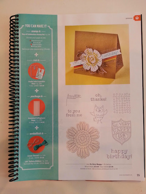
Today's tip is that the new catalog is full of tips! I'll be sharing some of those over the next couple weeks. First off, to help you get started, many of the pages have a, "You Can Make It" box. You can see one on page 55 of the 2014-2015 Catalog. Here you will find not only the supplies needed to make the projects on page 54 (not pictured here) but also the colors that are used. This is helpful if you are trying to coordinate other projects, or love the colors but not the project. How helpful is this?!

Friday, June 13, 2014

Flashback Friday

Here is a flashback to our June 2012 Stamp Club projects:


I am so excited for tonight's Stamp Club meeting! This will be our first meeting during the new catalog and I can't wait to see what everyone will order! I'm also planning on adding some things for myself to the order, so that will be an added bonus! ;)
I was trying to decide what would be a good project for this month's club. At first I was thinking of decorating journals since I have been thinking about using one for some projects this Summer. Then, a friend shared some new projects she had made and I fell in love with her Matchbook sticky note holder. What a simple, cute idea! It actually came from our demonstrator magazine we get monthly (it's chock full of wonderful ideas!) and she put her own spin on it. I spun off a little from hers and this is what you get: Simple and sweet!
To make a matchbook for 3x3" sticky notes, cut a piece of card stock to 9 1/4" x 3 1/8". Turn in lengthwise and score at 3 3/8", 3 3/4" and 7 3/4". Use any borner punch you like on the end closest to the 7 3/4" score line. Fold at each score and decorate as you'd like. Using Sticky Strip, adhere the sticky note pad insdie. Add a brad (here I used the Antique Brads) or a staple at the punched end and tuck the flap inside.
This card was also inspired by another project in Stampin' Success, our demonstrator magazine. I just fell in love with the use of Calypso Coral and Soft Suede. The sentiment is from the Elements of Style stamp set and the butterflies from the Creative Elements set were stamped with Soft Suede ink on Crumb Cake card stock and the edges were sponged with Calypso Coral.

Tuesday, June 10, 2014

Terrific Tips Tuesday


Hello again! Today's tip is a simple one. We all love storage and organization, whether we are good at it or not. With the new catalog coming out last week, it's time to do a little re-organization. One of the things I do is organize my ink pads and paper. I found when I was a new demonstrator that it took a lot to keep the colors straight. To have some consistency, I put my inks and paper in order by color families and then in the order you find them in the catalog. If you look in the catalog, there is an area at the beginning of the accessories section (starting on page 176 in the 2014-2015 catalog) that lists the color families and each color within the color family. I found that it was so much easier for me to keep my colors in this order, also. The consistency made it easy for me to find the colors I was looking for, whether in my ink caddy or my hanging folders that I use to hold my 8-1/2 x 11 card stock. I often was choosing colors by looking in the catalog, so this added to the consistency. Now I can often look at a color and know its name, so the order is not as big of a deal. In fact, I organize my 12 x 12 card stock in ROYGBIV fashion. As a visual person, I find this incredibly pleasing to the eye. You might want to organize your inks and card stock that way, too. But whichever way you choose, keeping your ink pads and papers in the same color order will make finding exactly what you need a breeze.


I use the Color Caddy to store my ink. You can read this previous Tuesday Tip to learn more about how I store my card stock.


Friday, June 6, 2014

Flashback Friday

Today I wanted to share a card using one of my favorite sets - The Open Sea. We were on vacation this week, so the beach and all things nautical have been on my mind. This set is my go-to when I need to throw together a masculine card. It's also a great one for a vintage look. I also wanted to share this card because it's a Father's Day card and in case you needed the reminder, Father's Day is coming up soon: June 15!

A June must-have: A Father's Day card. Making a nice masculine card can often be diffucult. In our house, the boys outnumber the girls, so I am always keeping my eye out for color combinations and stamp sets that I can use for the cards I make for my guys and the scrapbook pages I create for them. The Open Sea stamp set, found in the Summer Mini Catalog, is so versatile I just had to have it. And, as you can see here, it makes a perfectly handsome card for that special guy in your life!


Stamp Sets:
The Open Sea
Something to Celebrate

Paper:
Not Quite Navy
Whisper White
Baja Breeze
More Mustard

Ink:
Basic Gray
Crumb Cake
More Mustard
Not Quite Navy

Accessories:
Whisper White/Early Espresso Baker's Twine
Gold Brads

Tuesday, June 3, 2014

Terrific Tips Tuesday

Have you had a chance yet to check out the new catalog and all the fun new toys inside?! If you're lucky enough to be holding this beautiful new catalog in your hands, this tip is for you. Run down to your local Office Max or Staples and have that catalog spiral bound. They can do this for you in their copy center and is usually only costs around $4. I also get a clear plastic front added along with a protective black plastic back page. This not only keeps my catalog looking new all year long but it also makes it a lot easier to look through the catalog. I often find inspiration in these pages and when I can either lay the catalog out flat or fold it around completely, this keeps makes the pictures easier to see and keeps the pages from flipping on me. You'll love this tip!